VIEW PROJECT
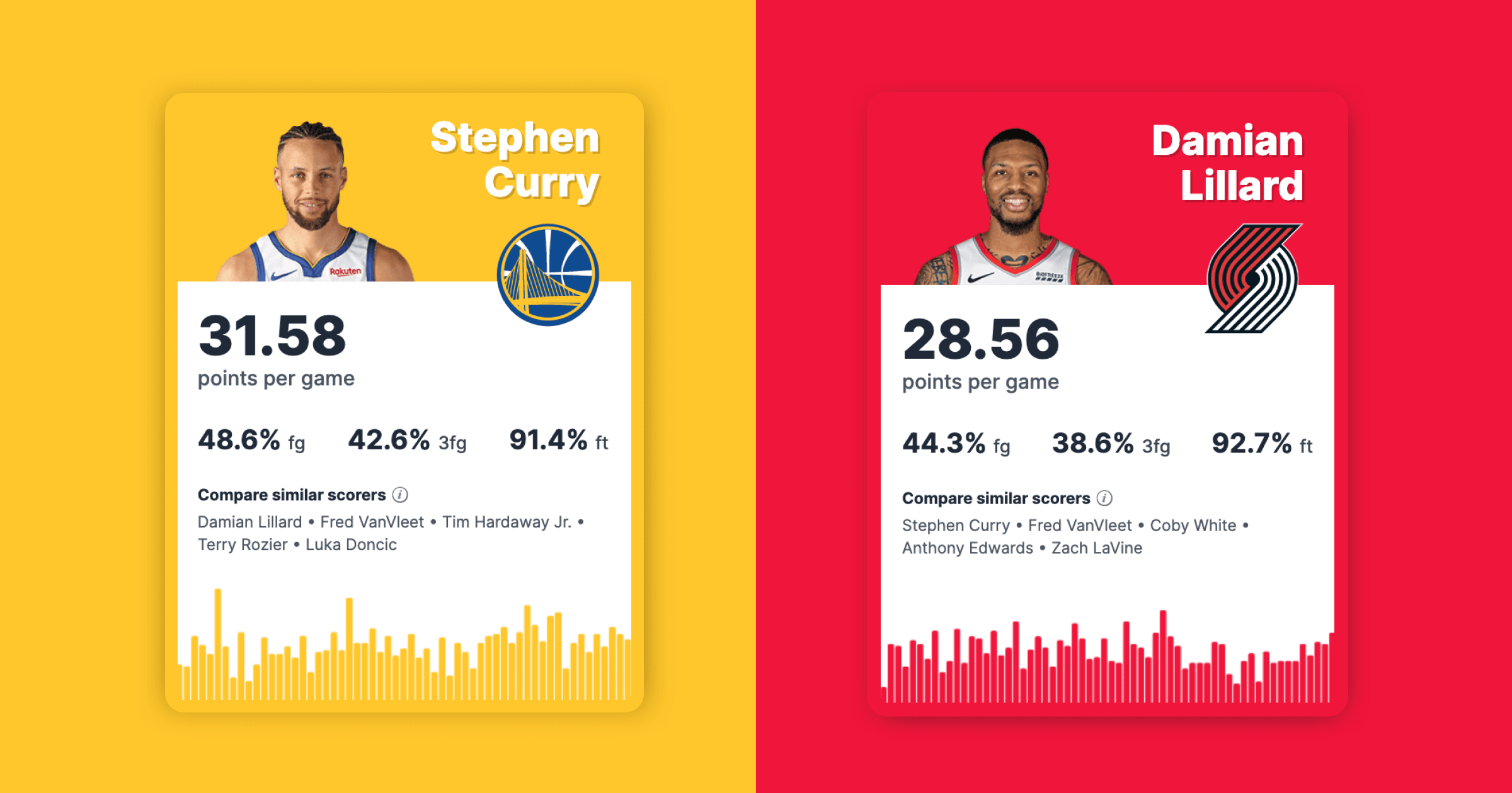
NBA Player Stats and Shot Charts
Create highly customized and interactive shot charts for the NBA.
Exploring complex datasets through interactive and static visualizations.
Create highly customized and interactive shot charts for the NBA.
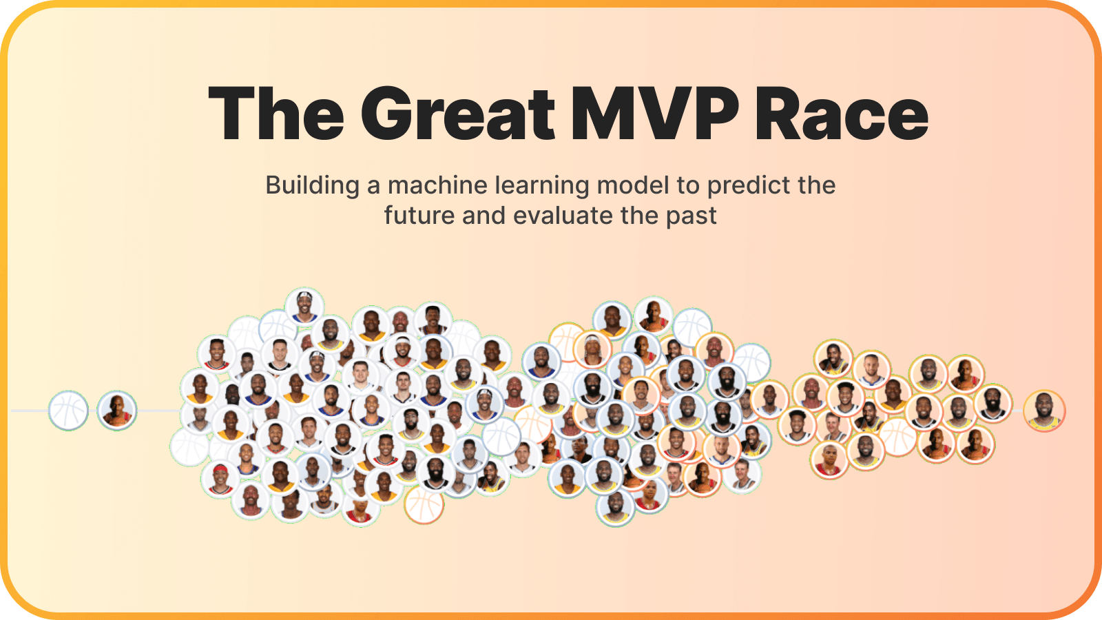
Building a machine learning model to predict the future and evaluate the past of the NBA's most valuable players.
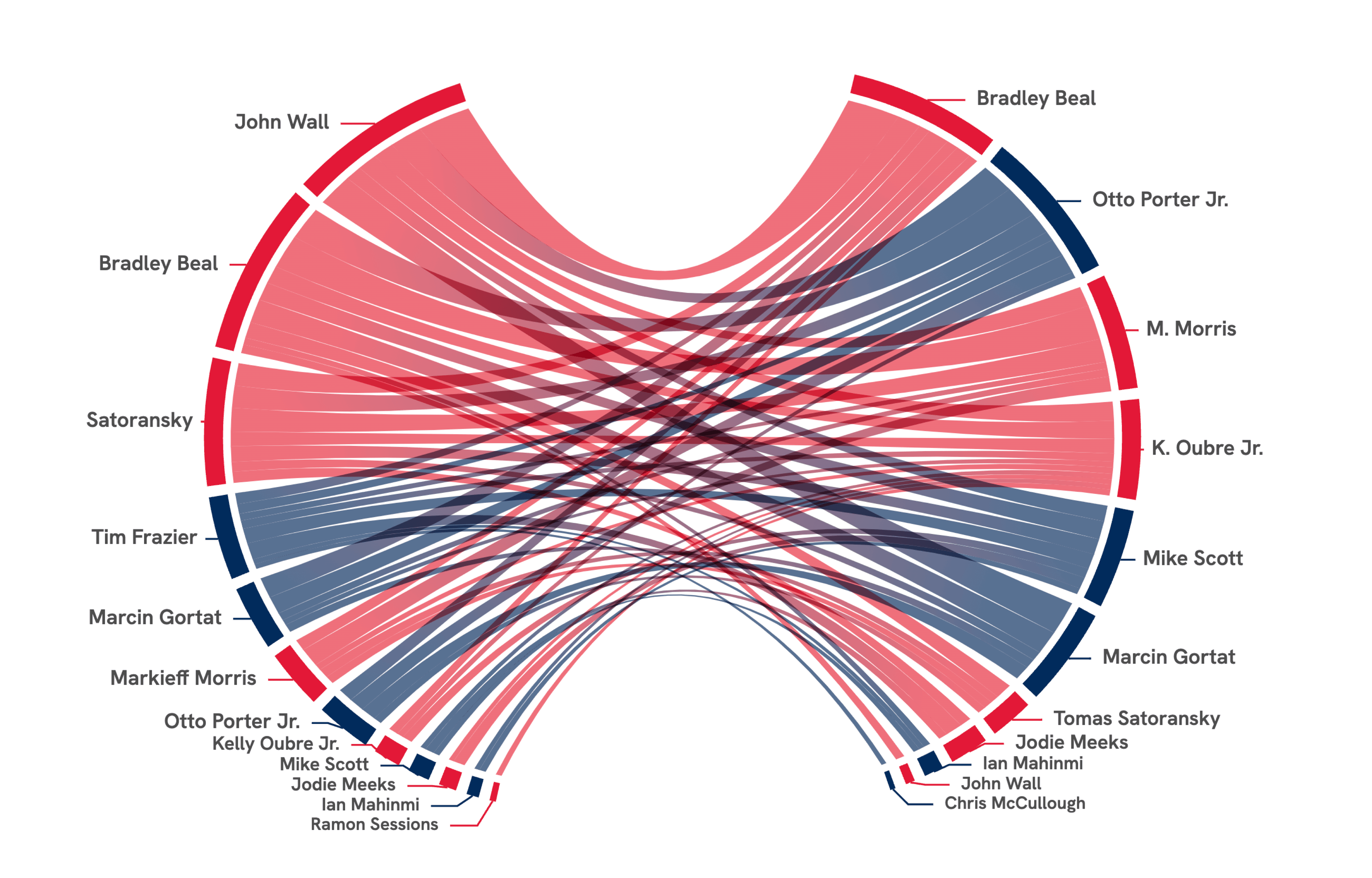
A way to visualize passing on your favorite NBA team.
Measuring the best games with play-by-play win probability analysis.
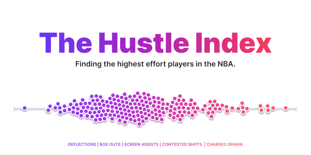
A metric to highlight the things that don't show up in the box score.
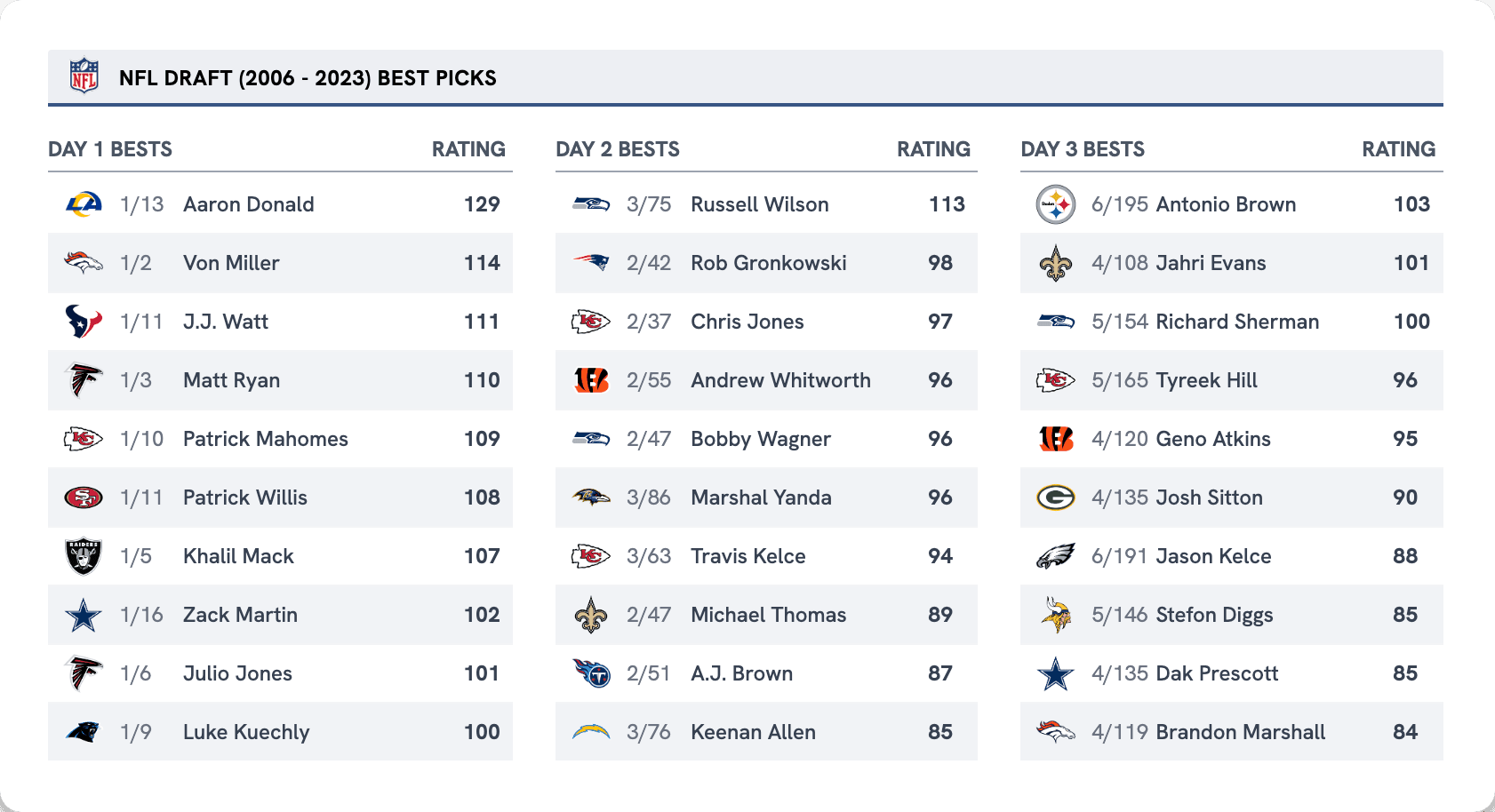
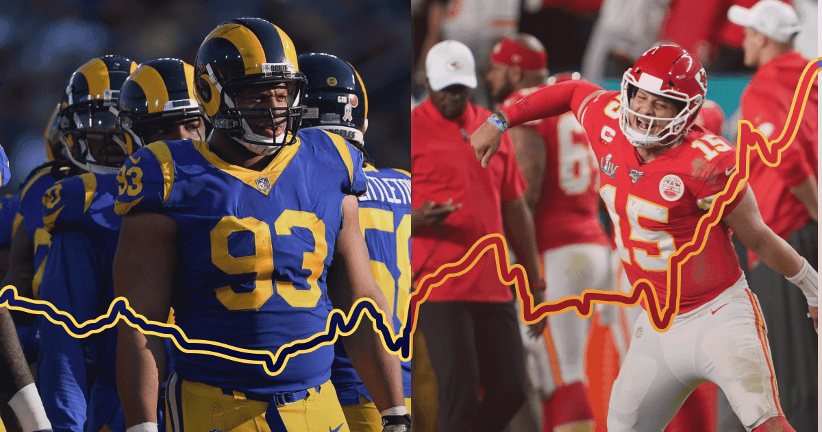
Using PFF Scores + Approximated Value (AV) to grade the last 20 years of NFL drafting.
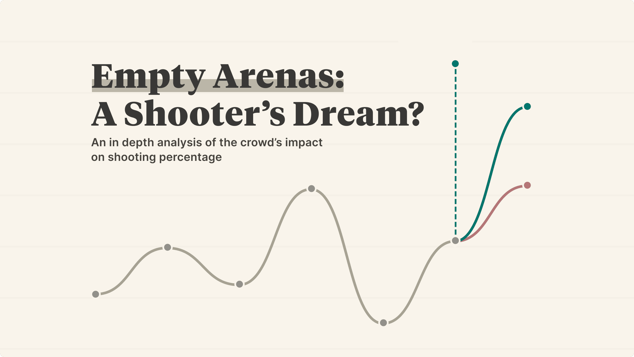
An in-depth analysis of the crowd's impact on shooting percentage
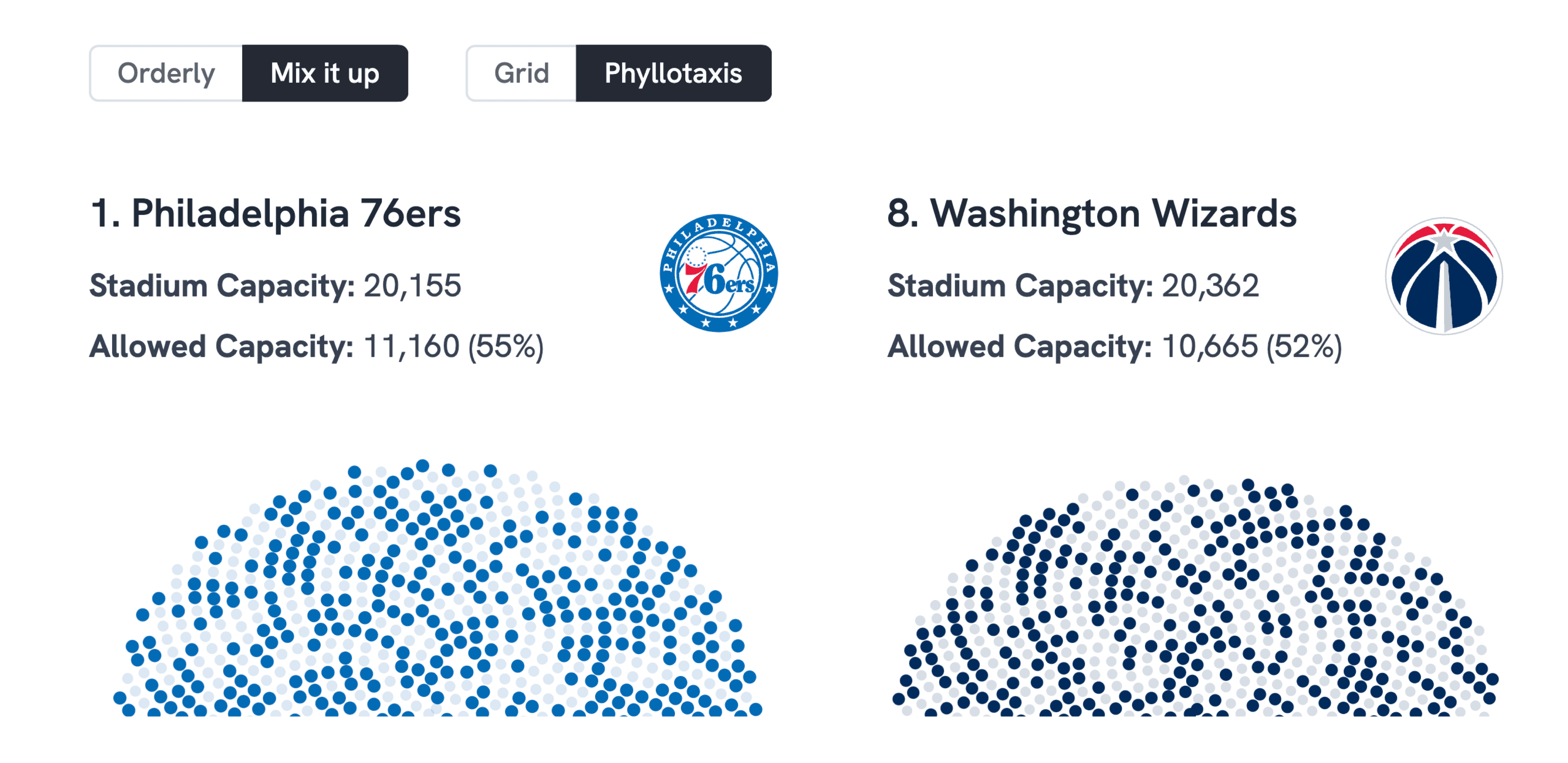
Taking a look at home court advantage in the year of COVID.
A visual data analysis of all tech pitches on Shark Tank. All visualizations done with D3 and Vega. My report won the challenge presented by Triplebyte and its $500 reward.
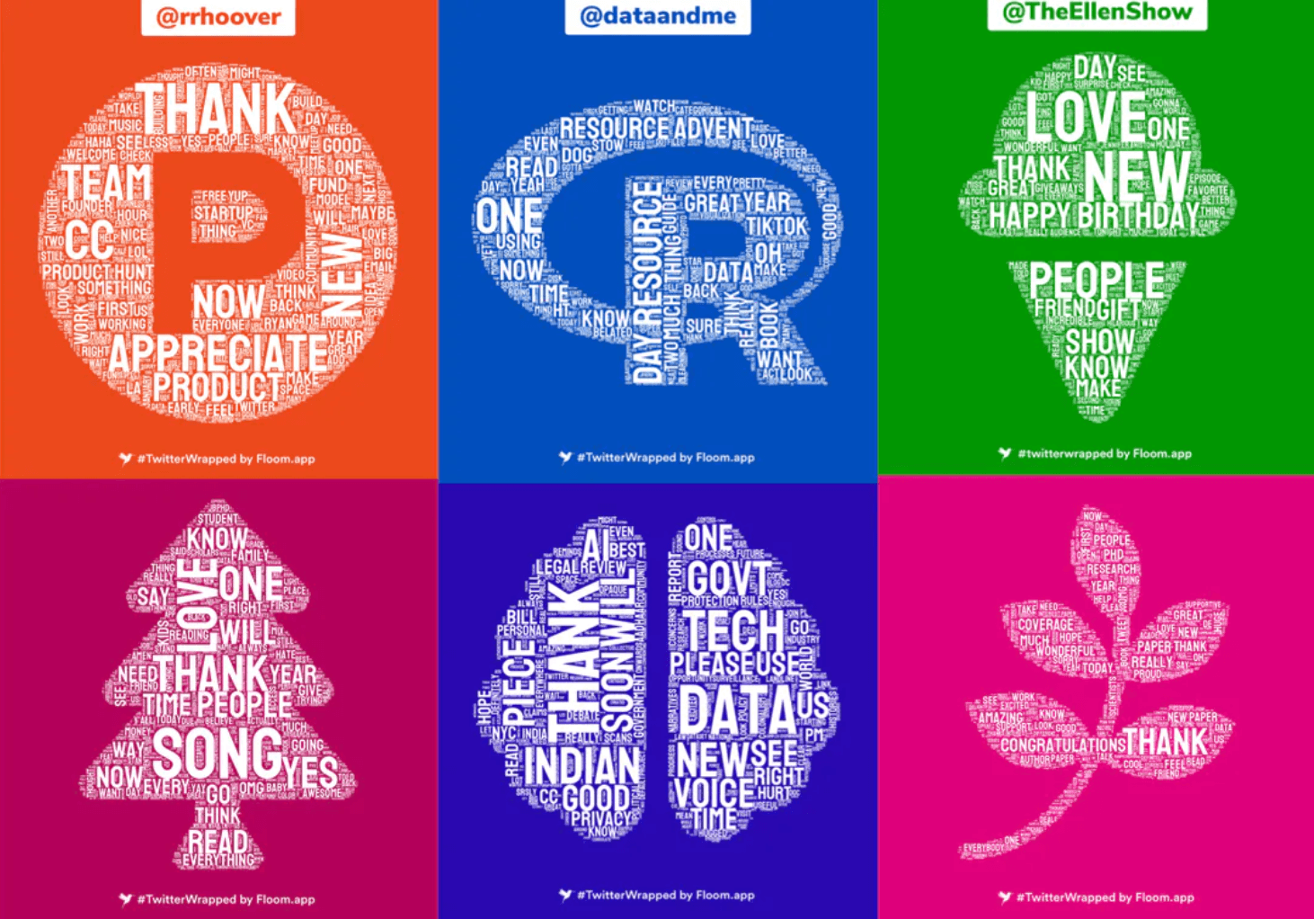
Create a beautiful word cloud visualization of your Tweets throughout the year with #TwitterWrapped. Your unique word cloud highlights the language that you use with an unusually high frequency.
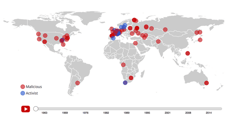
An overview of malicious and non-malicious breaches on nuclear facilities worldwide. Created for National Consortium for the Study of Terrorism and Responses to Terrorism.
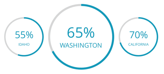
"A rising tide lifts all boats." A look at the nationwide rise and fall of unemployment.
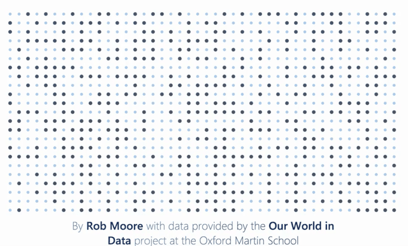
A 60-second overview of how far the world has come to decrease child mortality rates in the past 200 years.
A rebrand and redesign of the existing LiveStories charting components.
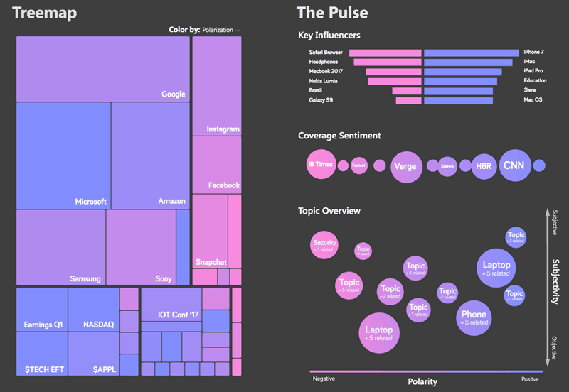
A dashboard designed to showcase sentiment analysis on the latest tech news.
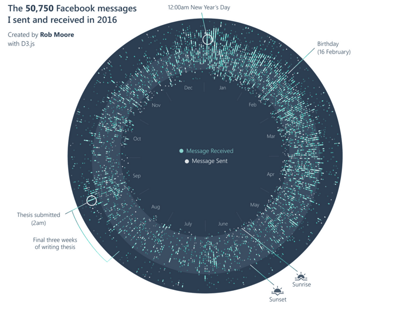
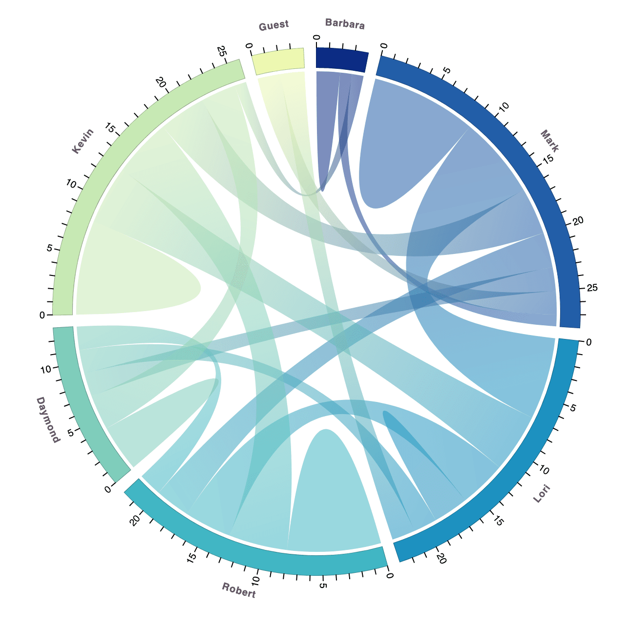
An afternoon project to visualize the Facebook messages I sent over the entire year.